


A Mobile Friendly Website is a User Friendly Website

Is your website mobile friendly? Can your site visitors – and potential customers – easily interact with your brand, shop your products, view your services, or get in touch with you while viewing your website on a mobile device?
The shift to e-commerce (online shopping) platforms has driven a whole new approach to how we’re interacting with devices, whether that’s your phone, tablet or computer. Ease of use, even on the smallest phone is a must as consumers shift away from brick and mortar shopping, to online. The importance of an updated, appealing, and easy-to-use user interfaces (UI) could make a real difference in the success of your business.
And beyond just e-commerce, we are turning to digital for all of our searches. Whether we are looking for a local plumber or contractor, photographer or event space, coffee shops and food nearby, banker or realtor, or local resources, we most often turn to our phones for a quick search. And how easily we can find, learn about, and contact our options make all the difference in who we choose.
All in all, the balance of power has shifted dramatically away from desktop devices to mobile, making the role of the user interface design even more important.
What does mobile friendly mean?
A mobile-friendly website is a website designed to display website content on mobile devices; i.e. smartphones and tablets. It’s optimized for mobile devices because it makes it far easier for mobile users to read the desired content and navigate the website they choose to visit.
Namely, a mobile-friendly website easily adjusts to the screen size and resolution of the mobile devices that visitors to the site are using. This enables them to find what they’re looking for in a matter of seconds.
By formatting the interface and the content of your website in a manner that is mobile-friendly, not only will you make navigation easier and the text larger for it to be easier to read, but you will also optimize your website for touch screens by adding touch-friendly elements. And your website’s download speed will be improved measurably.
Important pieces to consider:
- Touch interface: It’s not only screen space issues that need to be thought through. Touch interface has to be much more space generous. Human fingers and thumbs demand larger tap areas, unlike mouse-driven cursor interfaces. This makes the economical use of the premium space a must. Simplification has to be a priority in any design
- Keep menus short and sweet: The challenge with a mobile user is getting them to the right section of your site before they swipe elsewhere. The default for many mobile interfaces is the Hamburger menu (see examples below). Other options include tabbed interfaces, swipe-able menus, and tappable images. Work with your web developer to understand what may be best for your business and the key information you are trying to share.
- Keeping your interaction within reach and consistent: Keep your calls-to-action front and center. Don’t let your navigation disappear. Make it clear and easy to get back to the homepage. If it’s on your full website, it should be on your mobile site.
- Flexible media: Another important part of responsive web design is getting the media to adapt to the browsing environment. Some of the elements on the page may need to be resized, or removed from the display completely for certain devices.
- eCommerce: One of the biggest challenges the mobile experience has is providing a streamlined and easy checkout and eCommerce experience.
Here are some statistics for you:
- 57% of consumers said: A business with a poorly designed mobile website is not likely to be recommended
- Google might now eliminate your webpage from rankings in a mobile search (SERPs) if your webpage is not mobile-friendly
- It takes less than a second for a mobile user to reach an opinion about your website.
- 82% of customers use their mobile phones while making a decision about purchasing in-store.
- VERY IMPORTANT: 40% go to your competitor instead, after a bad experience with your mobile site.
- 40% of all mobile searches are for a local business or interest.
- 88% of consumers, searching for a local business using mobile devices end up calling or visiting the business.
- Comparable searches without using “near me” keywords have grown by 150% YoY.
Remember, we are rapidly approaching where the majority of consumers will be reachable via their smartphones and devices. This clearly shows that every business will need the following:
- Well optimized, mobile-friendly websites
- Location-based optimized information
- And a good mobile marketing strategy
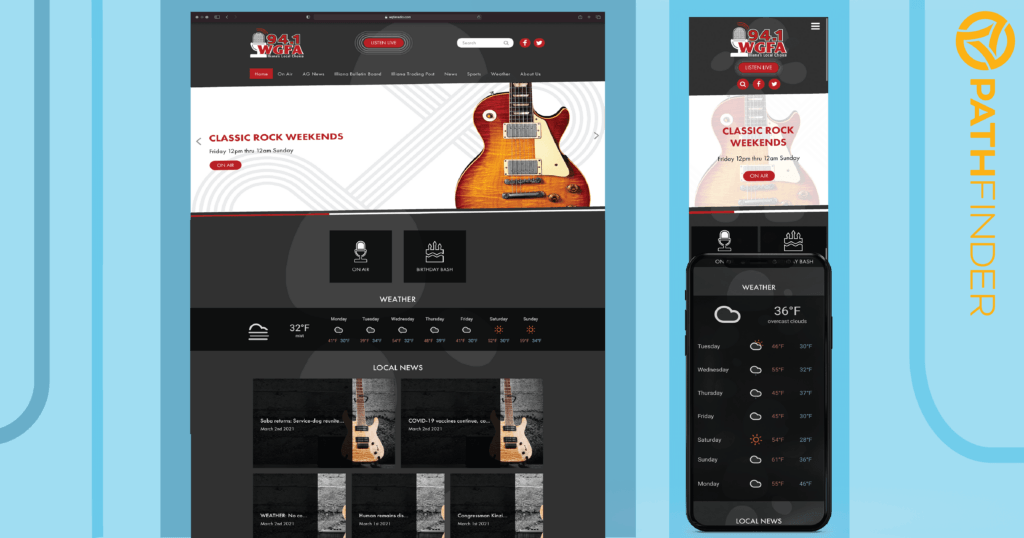
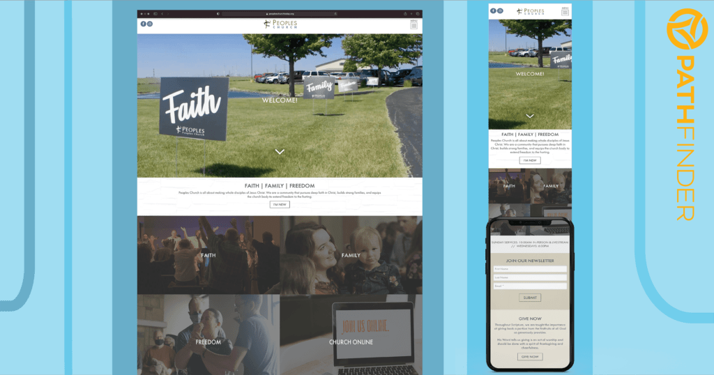
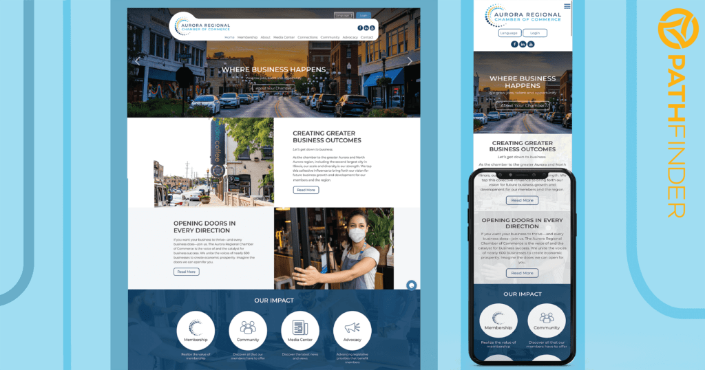
Examples
Does your website pass the test?
Is your website mobile friendly and responsive? Not sure? Pathfinder can help you better navigate the move!


