Behind the Brand, Part II
We already dove a little into who we are as a brand, but now we want to tell you a little more about why we chose our new brand…
Our Brand Voice
Every brand has – or should have – a brand voice. It helps to humanize your brand, and in turn, makes it easier for people to relate to, and connect with, your company. It also helps build your brand its image, rounding out all the little details and pieces, filling in gaps and connecting the story.
As a brand, the voice of Pathfinder IS:
- Spirited
- Mindful
- Visionary
- Strategic
- Friendly
We are NOT:
- Corporate
- Stuffy
- Robotic
- Goofy
- Entitled
- Sales-y
- Scripted
Once we defined our voice, it helped us build our brand style…
Our Colors
We chose our colors strategically to incite particular feelings in our clients.
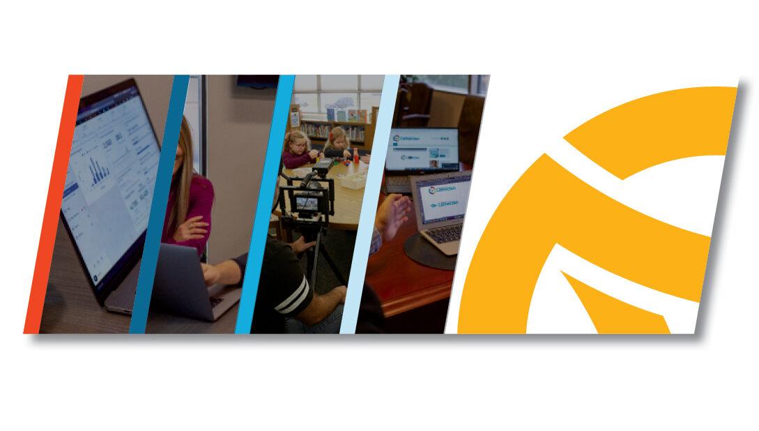
Yellow / gold elicits clarity and warmth. We want our clients to know that we are helping them find and walk down their own paths – and this needs to be a friendly, understanding, and clear process.
Our blue colors stand for trust, dependability, and strength. Meaning you can count on and trust Pathfinder and our people. We treat your business like our own – with great care and attention. And we find strength in our employees and our client partnerships to weather hardship, build tenacity, and bring renewed excitement to your organizations.
Our Logo

The Pathfinder logo was born out of a Celtic symbol of path. This symbol is also known as a triskelion – a symbol of completeness and progress.

At Pathfinder, we help organizations who have been stuck find and see real progress. We stand by and help guide them through their own path to growth and success.
But, it also has a deeper meaning for us. Pathfinder was born out of the merger of three businesses, all doing complementary work with the same passion for their community and helping local organizations tell their stories.
All three companies were working towards the same goal – but separately. Coming together not only simplified the process internally, but it brought a better, more defined strategy for all of our clients. We merged together our passion and drive, capabilities and talents, experience and expertise, and we found our completeness.
We broke out of the “way we’ve always done things,” and we became something greater for all.
Still Changing
No one brand is static – or at least it shouldn’t be. Growth is applauded and adaptation is required.
We know that to be true for Pathfinder, as well. We know we will adjust and tweak as we go. But as we grow, our brand at its core will remain. Because no matter what may change outwardly — inwardly we will always be this Pathfinder.


